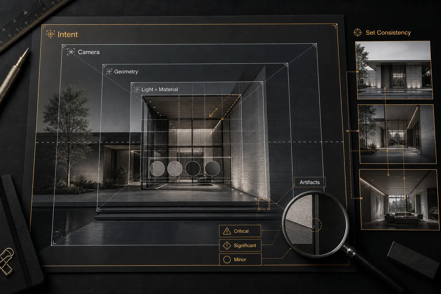
Architectural rendering quality is not simply a measure of maximum photorealism. A successful rendering communicates the intended design clearly, maintains architectural credibility, follows a deliberate visual direction, and avoids faults that could distract or mislead the client. Realism matters when it supports those goals, but a technically polished image can still fail as architectural communication.
Reviewers often notice texture seams or masking errors while overlooking a weak camera, concealed entrance, inaccurate geometry, or inconsistent design state. A more reliable process moves from macro decisions to micro defects: design communication first, followed by composition, camera, geometry, context, lighting, materials, realism, artifacts, and consistency across the complete image set.
Table of Contents
- What Architectural Rendering Quality Actually Means
- Review Composition and Camera Before Surface Detail
- Verify Geometry, Design Fidelity, and Context
- Evaluate Lighting, Materials, and Realism
- Inspect Artifacts and Image-Set Consistency
- Run a Repeatable Pre-Client Quality-Control Pass
- FAQ
- What to Do Next?
What Architectural Rendering Quality Actually Means
Architectural rendering quality combines several related but distinct criteria: effective design communication, clear visual hierarchy, architectural correctness, visual plausibility, technical finish, and production consistency. Their relative importance changes with the image’s purpose. A competition image, planning view, marketing interior, and early design study do not require the same visual language, but each should communicate responsibly within its agreed role.
Architectural correctness and visual plausibility are not interchangeable. An image can look believable while containing inaccurate openings, altered proportions, impossible circulation, misleading site conditions, or furniture that distorts the apparent scale. It can also represent the model accurately yet communicate poorly because the camera, lighting, or surrounding elements hide the main idea.
Realism is similarly distinct from communication. Stylized imagery can deliver excellent architectural visualization quality when its abstractions are deliberate and its visual rules remain coherent. Extensive surface detail, by contrast, cannot rescue an image that obscures the entrance, flattens the spatial sequence, or directs attention toward an irrelevant prop.
Consider two hypothetical entrance views. The first has polished vegetation, detailed reflections, and convincing surface wear, but a compressed viewpoint and deep shadows make the entrance difficult to identify. The second is less photorealistic, yet its camera clearly describes the massing, access route, canopy, and material relationships. For a client reviewing arrival and access, the second image is more successful.
This leads to a useful review order:
- Confirm the intended message and immediate visual hierarchy.
- Assess the camera, framing, and composition.
- Verify design fidelity, geometry, scale, and context.
- Evaluate lighting, materials, and visual coherence.
- Inspect local artifacts and compositing defects.
- Compare every image for continuity across the set.
Revision priority should follow the same hierarchy. First address faults that misrepresent the design or prevent the image from communicating its purpose. Next correct significant visual weaknesses that reduce clarity or credibility. Minor polish defects come last unless they are conspicuous enough to distract at the intended viewing size.
Review Composition and Camera Before Surface Detail
Before judging surface detail, state what the image is meant to communicate. Is it describing the overall form, the arrival sequence, an interior spatial relationship, a material transition, or a particular atmosphere? Without that reference, composition review becomes a debate about personal taste rather than an assessment of whether the image performs its job.
At thumbnail size, examine what attracts attention first, second, and third. The architecture should have an intelligible focal hierarchy, even when the composition is intentionally complex. Look at visual weight, balance, negative space, foreground and background relationships, and tangencies where unrelated edges appear to touch. Bright props, high-contrast people, or dense vegetation can become dominant shapes even when they occupy little of the frame.
Then assess the camera as an architectural decision. Review camera height, field of view, horizon placement, perspective convergence, and lens distortion. The viewpoint should feel physically credible for the intended observer while revealing the required spatial information. An excessively wide view can exaggerate depth and room size; excessive compression can flatten spatial relationships. Neither treatment is inherently wrong, but both should be intentional.
Cropping deserves equal attention. It can remove distracting context, but it can also hide a building boundary, circulation route, ceiling condition, or relationship needed to understand scale. People, vehicles, planting, furniture, and props should support the spatial reading rather than serve as automatic decoration.
Imagine an exterior view with a very wide field of view. The building appears longer than expected, foreground planting blocks the entrance, and a bright vehicle attracts more attention than the facade. Refining the cladding texture will not solve the central problem. Repositioning the camera, controlling the foreground, and reducing the vehicle’s visual weight will have a much greater effect. In professional architectural rendering, camera choice and hierarchy must be directed rather than accepted as incidental consequences of scene setup.
Verify Geometry, Design Fidelity, and Context
Geometry should be checked against the current approved design information, not against memory. The review brief needs a defined reference and a clear record of unresolved areas. If drawings, models, or schedules conflict, flag the uncertainty for confirmation rather than treating ambiguity as permission to invent a solution.
Begin with elements that shape the architectural reading: overall massing, structural and facade grids, openings, slab edges, ceiling drops, wall thicknesses, stairs, railings, doors, built-in fixtures, and prominent junctions. Then inspect alignments, intersections, penetrations, gaps, floating objects, duplicate elements, incorrect normals, smoothing faults, and inconsistent edge treatment. Repeated or procedural elements require particular attention because one setup error can spread across an entire facade or interior.
Scale cues must agree with one another. Doors, people, furniture, vehicles, trees, ceiling heights, and facade modules collectively tell the viewer how large a space is. If furniture is undersized while doors are correct, the room may appear more generous than the design supports. A realistic material finish does not make that reading more accurate.
Context also carries factual weight. Neighboring buildings, distant views, landscape maturity, terrain, weather, and occupancy can help explain a proposal, but they should not imply confirmed conditions when the references do not support them. Generic context may be acceptable under an agreed visual direction; misleading context is not.
For example, an interior could have convincing daylight, sophisticated fabrics, and carefully balanced color while showing an incorrect ceiling drop, a misaligned door, and furniture scaled too small. These are not merely technical imperfections. Together they change the perceived height, circulation, and generosity of the room. Architectural CGI quality depends on accurate geometry, proportion, and context beneath the visible polish.
Evaluate Lighting, Materials, and Realism
Lighting review should begin with coherence. Do the sky, direct light, shadows, reflections, interior fixtures, and exposure describe a compatible time and condition? A scene becomes difficult to trust when sunlight arrives from one direction, composited shadows suggest another, and window reflections imply an unrelated sky.
Next ask whether the light explains the architecture. It should reveal form, depth, circulation, and significant material changes without concealing information the image is expected to communicate. Look for clipped highlights, crushed shadows, implausible light sources, conflicting color temperatures, excessive bloom, and local post-production adjustments that break the scene’s overall logic. Dramatic contrast can be appropriate, but not when it erases the project’s main feature.
Materials should be judged as systems rather than as texture files. Recognition comes from the interaction of geometry, texture scale, mapping, roughness, reflectivity, surface relief, edge behavior, lighting, and surrounding objects. A high-resolution map at the wrong scale remains wrong. Physically based settings also do not guarantee a convincing result if the surface response, model edges, or illumination contradict the material being represented.
A hypothetical stone facade might look synthetic because the texture pattern is too small, repeats every few panels, and has identical roughness across the elevation. If grazing light produces no meaningful surface depth, adding sharper texture detail will not correct the problem. The reviewer should identify the interacting causes: incorrect scale, visible repetition, uniform surface response, and lighting that fails to reveal the stone’s intended character.
Common photorealistic rendering quality failures include uniformly glossy surfaces, unnaturally perfect edges, repeated patterns, weak contact relationships, over-sharp reflections, and uncontrolled sharpening or color grading. Controlled imperfection can help, but random dirt is not a substitute for material understanding. Variation should follow plausible construction, use, or weathering patterns while remaining appropriate to the project stage and creative direction.
A high-quality architectural rendering can therefore be stylized or photorealistic. What matters is whether its visual rules remain consistent and whether lighting and materials clarify the architecture rather than compete with it.
Inspect Artifacts and Image-Set Consistency
Detailed inspection works best at three scales. Thumbnail view reveals hierarchy and composition. Normal delivery size exposes overall credibility, material reading, and compositing integration. Magnified view is useful for local faults such as noise, fireflies, jagged edges, denoising smears, banding, halos, texture seams, broken reflections, low-resolution assets, floating objects, and hard masking boundaries.
Composited people, vegetation, skies, and props need to belong to the same image. Compare lighting direction, shadow contact, scale, sharpness, color, perspective, and depth of field. A person with the correct pixel height can still feel misplaced if the feet lack contact, the light comes from the wrong side, or the figure is sharper than architecture on the same focal plane.
Image-set consistency is a separate quality dimension. Three images may work individually yet form an unreliable delivery when placed side by side. Compare repeated materials, facade details, landscape conditions, furniture, fixtures, weather, season, exposure, color treatment, occupancy, and design state. The same glazing should not shift from neutral to strongly blue without an intentional lighting reason, and a fixed exterior fixture should not disappear between views.
Variation is not automatically a fault. Different times of day, occupancy states, or moods can be deliberate parts of the visual direction. The reviewer’s task is to distinguish purposeful variation from accidental discontinuity. That distinction should be established in the brief rather than guessed during final inspection.
Finish with a clean-output check for accidental crops, unexpected borders, stray marks, incomplete masks, and other delivery-stage defects. This is where pixel-level attention belongs: after communication, camera, design, lighting, and materials have been resolved. Strong archviz quality requires both local finish and continuity across the complete client-facing set.
Run a Repeatable Pre-Client Quality-Control Pass
A repeatable review begins with a concise brief: the image’s intended message, current design reference, approved visual direction, expected set of views, and known unresolved items. This creates a boundary between visualization defects, creative choices, and design questions that require an architect or another decision-maker.
Conduct the review in distinct passes. First, inspect without magnification and judge the immediate reading, focal point, atmosphere, and design communication. Second, examine camera, composition, geometry, context, scale, lighting, and materials. Third, move closer to inspect artifacts, edges, masks, reflections, and compositing. Finally, compare all views side by side for continuity.
Classify every comment by impact:
- Critical: the issue misrepresents the design, conceals the intended message, or creates a serious contradiction.
- Significant: the issue weakens composition, credibility, material reading, lighting coherence, or set consistency.
- Minor: the issue concerns local polish and does not materially change the architectural understanding.
Feedback should identify the location, observable problem, reason it matters, and desired outcome. “Foreground tree blocks the main entrance; reduce or reposition it so the access point reads clearly” is more actionable than “improve composition.” Describe the visual result needed without prescribing a technical solution when several valid production methods could achieve it.
Suppose the first pass identifies an unclear entrance. The architectural pass finds incorrect mullion spacing and paving that reads as excessively glossy. Magnified inspection reveals masking halos, while the set comparison shows inconsistent facade color. The entrance and mullions should lead the revision order because they affect communication and design fidelity. Facade continuity and paving follow; small halos come later unless they are conspicuous at delivery size.
Review again after corrections. A camera adjustment can change cropping, reflections, and foreground balance. A material correction can alter exposure or color relationships. A replaced asset can create a continuity error in another view. Architectural rendering quality control is not complete when comments are issued; it is complete when the revised output has been checked as a whole.
The aim is not endless refinement. Architectural visualization quality control establishes a threshold appropriate to the image’s purpose, stage, and viewing conditions. A disciplined sequence makes professional judgment more consistent without pretending that a checklist can replace it.
FAQ
What makes an architectural rendering high quality?
A high-quality rendering communicates the design clearly, uses an intentional camera and composition, preserves architectural correctness, maintains coherent lighting and materials, avoids distracting artifacts, and remains consistent with related images. Maximum photorealism is not the sole criterion.
How can you review architectural rendering quality efficiently?
Use a macro-to-micro sequence: assess design intent and hierarchy first, then camera and composition, geometry and context, lighting and materials, local artifacts, and image-set consistency. Review at thumbnail, normal, and magnified scales because each scale reveals different categories of problems.
Does an architectural rendering need to be photorealistic to be high quality?
No. The appropriate visual language depends on the image’s purpose and approved creative direction. Stylized imagery can be high quality when it communicates clearly, represents the architecture responsibly, and follows coherent visual rules.
Which architectural rendering errors should be fixed first?
Fix errors that misrepresent the design or undermine the image’s central communication goal first. Then address major camera, composition, lighting, material, and consistency problems. Minor artifacts follow unless they are visible enough to damage credibility at the intended viewing size.
How should quality-control feedback on renderings be written?
Identify the location, observable problem, consequence for communication or credibility, and desired result. Separate confirmed defects from subjective preferences and unresolved design questions so each issue reaches the appropriate decision-maker.
What to Do Next?
Choose one pending image set and define what each view must communicate. Confirm the current design reference and intended visual direction, then conduct three separate passes: a thumbnail communication pass, a normal-scale architectural and visual pass, and a magnified artifact pass.
Record each issue as critical, significant, or minor. After revisions, compare every view side by side for design state, materials, context, lighting, and color continuity. Complete one final clean-output review rather than assuming that each requested correction remained isolated.